

I was reading this article in the Washington Post a couple of days ago. It’s about data from Florida which shows that girls outperform boys at school, and that the gender gap is bigger at worse schools.
It’s well established that girls outperform boys at school, but seeing it visualised and quantified like that was fascinating, and I wanted to reproduce that data for UK schools. We frequently use American statistics to talk about social issues in the UK, which frustrates me; sometimes we’re close enough for it to generalise, but sometimes it doesn’t and it’s like there’s a gigantic metaphorical ocean between the two societies. We know that British girls outperform British boys, but I wanted to see how similar the situation is.
Luckily, the UK government has one of the best records for open data in the world, and so this information is pretty easily found here and here. The main challenge is actually getting through all the data to find the good bits, as so much of it is available, but I found it in the end. So, I shoved all that into R and messed about with some dataframes. Note that I’m not working with private schools here, just state schools… all 2488 of them which have full data for all metrics reported below. Also, all the data is only fully available for England, not the whole of the UK.
The first thing is to decide how to measure achievement. Here, I’m focusing on GCSEs, the standard qualification which most UK teenagers take at 16 and which marks the end of mandatory education. There are two good metrics for measuring GCSE achievement: the percentage of students who get at least five A*-C grades, and the average capped GCSE point score. The first is simple. Students generally take GCSEs in somewhere between seven and ten different subjects, and the percentage of them who score a grade C or above in at least five GCSEs is one of the main metrics that British people obsess over (for people outside the UK, I’m serious, the national newspapers print this figure for all state schools every August when exam results come out). The second is a little more complicated, and it’s explained here. It’s measured by attributing a certain number of points per exam grade (58 for an A*, 52 for an A, and so on down in sixes). It then measures only a student’s top eight GCSEs. So, if you took 11 GCSEs, scored 6 A*s, 4 As, and a B, you’d get 6 x 58 plus 2 x 52 equals 452. This is then averaged across the school. Literally nobody outside government departments ever uses this, but it’s actually a pretty good measure; focusing on the five A*-C rate is a bit blind to quality over quantity, as a student who gets four A*s and four Ds harms the school’s statistics while a student who gets five Cs and three Fs is good for the school’s statistics, despite the first student clearly doing better overall.
The next thing is to decode the wording of the original article: “the gender gap is bigger at worse schools”. There are several ways of talking about what makes a school good or bad, so I’ll focus on three different metrics:
- The rating given to each school by the assessment organisation Ofsted. Each school is inspected every couple of years, and gets given an overall grade: outstanding, good, requires improvement, or inadequate. This is a useful, state-sanctioned measure of how good a school is.
- The average GCSE achievement data per school. Presumably, better schools get better results. This is a useful measure of how good a school is in terms of what many parents say they care about.
- The average wealth of the student body at the school. Let’s face it, when a lot of middle-class British people say “we were lucky enough that our son got into a good local school”, what they actually mean is “we’re so glad there’s no poor people there”. We can measure the average wealth of the student body by looking at the percentage of students who are eligible for free school meals. The higher the percentage, the poorer the student intake.
Firstly, let’s look at the gender gap in GCSE achievement by Ofsted data. This is categorical, so we can have some nice straightforward histograms. Boys are in light blue, girls are in dark pink. Sure, it’s gendered, but it’s an effective and intuitive colour scheme.
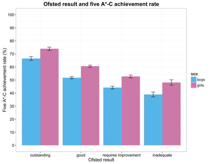
As you’d expect, the outstanding schools get better results than the good schools, and so on and so on. But, it seems that girls outperform boys across the board, regardless of how good the school is (I did an ANOVA on this; the gender gap effect is slightly less for outstanding schools, but it’s a negligible difference. The gender gap at outstanding schools is 7.5 percentage points versus about 8.5-9.5 percentage points for the other three assessments).
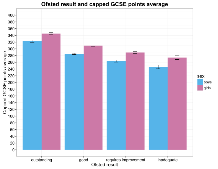
…and this is mirrored in the capped GCSE points average. Again there’s a tiny bit less of a gender gap in the outstanding schools compared to the rest, but girls do better than boys everywhere.
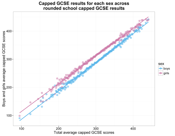
Right, so much for Ofsted. Let’s look at overall school GCSE achievement. This is continuous, so it’s going in a scatter plot. Plotting every single school’s boys’ and girl’s result was really messy, so this averages across schools on each percentage point on the x-axis (i.e. what you see at 50% is the average boys’ five A*-C rate and the average girls’ A*-C rate across all schools which got a 50% overall five A*-C rate). Likewise in the second plot with every single capped GCSE average points score, where each points score on the x-axis is rounded to a whole number and averaged with others of the same number. Rest assured that the lines of best fit are essentially identical in the larger, messier plots. I did do plots with standard errors, but thought I’d forgotten… then I looked closely, and realised that the standard errors were so small that they were barely distinguishable from the lines.
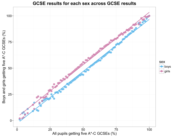
This one tells a clear story, and is very, very similar to Figure 1 in the Washington Post article which shows the standardised maths and reading assessment plot. However, there are two main differences:
- If anything the very worst schools seem to have less of a gender gap, especially in the five A*-C rate plot … although this is probably more about a lack of data at that end. (this is one of the few times I think it’s a good thing to have a lack of data)
- It basically doesn’t matter how good or bad the school is, the difference between boys and girls is consistent across all levels of achievement. The only place where boys and girls are almost equal is right at the top, where there’s a ceiling effect; assuming that each school is 50% boys, 50% girls, there can’t be a big difference between the two if a school is getting 99% five A*-Cs overall.
And now for the free school meals data, or the middle-class poverty aversion question. I’m going to bombard you with graphs here. First, just to show you, here are the messy ones where all rates for all schools are plotted:
")
")
…but like I said, it’s messy and hard to focus on, it’s like somebody spilt muisjes on the screen.
So, here’s the same plots but with all schools averaged together at each data point. This isn’t even at each percentage point, it’s to the nearest 0.1 of a percentage point, because there’s that much data.
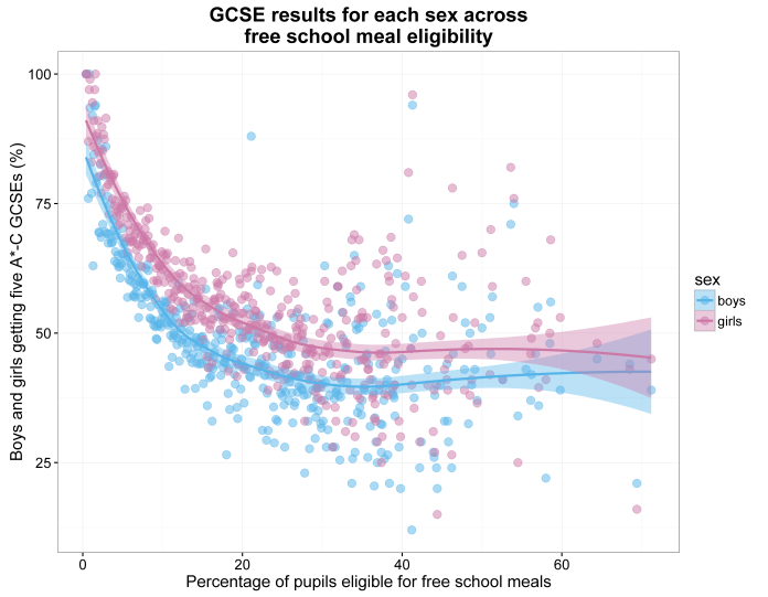
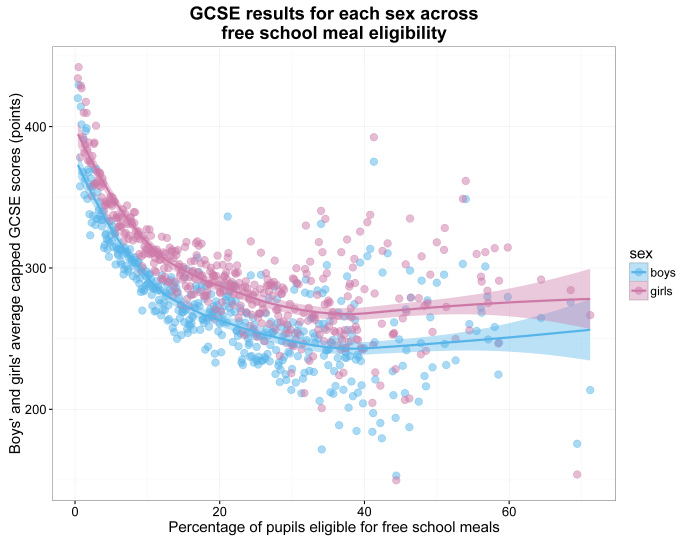
This also tells a very clear story. The schools with richer students get better results. I also found out the Pope’s religion, and something about bears and woods. But, again, there are the same two main points:
- There seems to be less of a gender difference in achievement at worse (well, poorer) schools, but this is probably because there aren’t that many seriously deprived areas. Not to say we don’t have deprivation in the UK, we definitely do, and it’s growing, but there are very few schools where over half the students qualify for free school meals (which probably says more about our ridiculously strict benefits threshold rather than the state of poverty).
- The performance and achievement gap remains even at the very best (well, richest) schools.
There’s also race data available, but I feel like that’s a topic for another blog at another time. This one is already long enough!
The point is this: while the Washington Post article was fascinating, it doesn’t fully generalise to British society. In the UK, the gender gap for school achievement barely gets bigger at “worse” schools, regardless of how you measure what a bad school is… which is a good thing, I guess? In fact, the gender gap for school achievement seems to be entrenched across education achievement and wealth.
Are girls outperforming boys, or are boys lagging behind? Is it both? I’m not an education specialist, I’m just a guy with Rstudio, so I’m reluctant to speculate… but I will anyway.
I think what I’ve ruled out here is any obvious overriding education level or socio-economic effects of the gender achievement gap. It could be that girls are simply more intelligent than boys, although such a simplistic solution seems unlikely. It could be a social peer pressure effect, in that it is more acceptable to be feminine and work hard at school than it is to be masculine and work hard at school (although that wouldn’t explain the reports that this gender difference is present at very, very early ages). It could be that teaching is a female-dominated profession; female teachers may knowingly or unknowingly choose course materials preferred by girls over materials preferred by boys, female teachers may knowingly or unknowingly favour, reward, and encourage problem-solving strategies preferred by girls over strategies preferred by boys, etc. etc., and that this may get entrenched over time. It could be that a culture which encourages and promotes girls’ education, given their denial of access to it until relatively recently, accidentally creates a culture where boys feel undervalued and demotivated. It could be that girls collaborate with each other on homework and exam revision more than boys do, which has been shown to effectively improve learning. It could be that exams favour a stereotypical female attention to detail over a stereotypical male “good enough” approach. It could be that more boys than girls simply don’t give a shit about their handwriting enough to make their answers legible. It could be that girls hit puberty a bit earlier than boys and are therefore out of adolescence a bit earlier than boys, meaning that girls are on average more mature when they take their GCSEs (but again, not if there’s an early years difference too).
It’s probably all of the above, and more, and it’s complicated. And it’s a problem.

Pingback: Vizzes revisited - The Data School